Hover Gallery stacks images in a figure element and reveals them progressively on hover. Use it to preview multiple variants of an image or show gallery previews without opening a new page.
Basic Hover Gallery


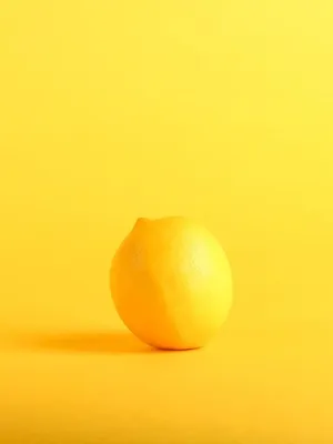

<c-lb.hover-gallery class="max-w-60">
    <img src="https://img.daisyui.com/images/stock/photo-1559703248-dcaaec9fab78.webp" />
    <img src="https://img.daisyui.com/images/stock/photo-1565098772267-60af42b81ef2.webp" />
    <img src="https://img.daisyui.com/images/stock/photo-1572635148818-ef6fd45eb394.webp" />
    <img src="https://img.daisyui.com/images/stock/photo-1494253109108-2e30c049369b.webp" />
</c-lb.hover-gallery>
In a Card
Product Name
Hover over the image to see more photos
<c-lb.card class="max-w-60 shadow bg-base-200" size="sm">
    <c-lb.card.figure>
        <c-lb.hover-gallery>
            <img src="https://img.daisyui.com/images/stock/photo-1559703248-dcaaec9fab78.webp" />
            <img src="https://img.daisyui.com/images/stock/photo-1565098772267-60af42b81ef2.webp" />
            <img src="https://img.daisyui.com/images/stock/photo-1572635148818-ef6fd45eb394.webp" />
            <img src="https://img.daisyui.com/images/stock/photo-1494253109108-2e30c049369b.webp" />
        </c-lb.hover-gallery>
    </c-lb.card.figure>
    <c-lb.card.body>
        <c-lb.card.title>Product Name</c-lb.card.title>
        <p>Hover over the image to see more photos</p>
    </c-lb.card.body>
</c-lb.card>
As Div
<c-lb.hover-gallery as="div" class="max-w-80">
    <img src="https://img.daisyui.com/images/stock/photo-1559703248-dcaaec9fab78.webp" />
    <img src="https://img.daisyui.com/images/stock/photo-1565098772267-60af42b81ef2.webp" />
    <img src="https://img.daisyui.com/images/stock/photo-1572635148818-ef6fd45eb394.webp" />
</c-lb.hover-gallery>
API Reference
c-lb.hover-gallery
| Property | Type | Default | Required | Description |
|---|---|---|---|---|
| class | string | - | No | Additional CSS classes to apply |
| as |
figure
div
|
figure
|
No | HTML element to use as container |
| Slot Name | Description |
|---|---|
| default | Image elements to display in the gallery |