Simple Card
Card Title
A card component has a figure, a body part, and inside body there are title and actions parts
<c-lb.card variant="primary" class="shadow-sm w-full max-w-96">
  <c-lb.card.body>
    <c-lb.card.title>Card Title</c-lb.card.title>
    <p>A card component has a figure, a body part, and inside body there are title and actions parts</p>
    <c-lb.card.actions justify="end">
      <c-lb.button>Buy Now</c-lb.button>
    </c-lb.card.actions>
  </c-lb.card.body>
</c-lb.card>
Featured Image
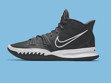
Card Title
A card component has a figure, a body part, and inside body there are title and actions parts
{% load static %}

<c-lb.card border class="bg-base-100 shadow-sm w-full max-w-96">
  <c-lb.card.figure>
    <img src="{% static 'lbdocs/img/stock/shoe.jpg' %}" alt="Shoes" />
  </c-lb.card.figure>
  <c-lb.card.body>
    <c-lb.card.title>Card Title</c-lb.card.title>
    <p>A card component has a figure, a body part, and inside body there are title and actions parts</p>
    <c-lb.card.actions justify="end">
      <c-lb.button>Buy Now</c-lb.button>
    </c-lb.card.actions>
  </c-lb.card.body>
</c-lb.card>
Solid Border
Card Title
A card component has a figure, a body part, and inside body there are title and actions parts
<c-lb.card border class="bg-base-100 shadow-sm w-full max-w-96">
  <c-lb.card.body>
    <c-lb.card.title>Card Title</c-lb.card.title>
    <p>A card component has a figure, a body part, and inside body there are title and actions parts</p>
    <c-lb.card.actions justify="end">
      <c-lb.button variant="secondary">Buy Now</c-lb.button>
    </c-lb.card.actions>
  </c-lb.card.body>
</c-lb.card>
Dashed Border
Card Title
A card component has a figure, a body part, and inside body there are title and actions parts
<c-lb.card dash variant="primary" class="w-full max-w-96">
  <c-lb.card.body>
    <c-lb.card.title>Card Title</c-lb.card.title>
    <p>A card component has a figure, a body part, and inside body there are title and actions parts</p>
    <c-lb.card.actions justify="end">
      <c-lb.button variant="secondary">Buy Now</c-lb.button>
    </c-lb.card.actions>
  </c-lb.card.body>
</c-lb.card>
Side-by-Side Layout
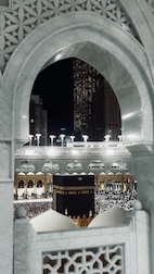
Visit Mecca!
Click the button to visit Mecca.
{% load static %}

<c-lb.card side border class="bg-base-100 shadow-sm">
  <c-lb.card.figure>
    <img src="{% static 'lbdocs/img/stock/mecca.jpg' %}" alt="Movie" />
  </c-lb.card.figure>
  <c-lb.card.body>
    <c-lb.card.title>Visit Mecca!</c-lb.card.title>
    <p>Click the button to visit Mecca.</p>
    <c-lb.card.actions justify="end">
      <c-lb.button variant="secondary">Visit </c-lb.button>
    </c-lb.card.actions>
  </c-lb.card.body>
</c-lb.card>
Image Background
Card Title
A card component has a figure, a body part, and inside body there are title and actions parts
{% load static %}

<c-lb.card imageFull variant="primary" class="shadow-sm w-full max-w-96">
  <c-lb.card.figure>
    <img src="{% static 'lbdocs/img/stock/shoe.jpg' %}" alt="Shoes" />
  </c-lb.card.figure>
  <c-lb.card.body>
    <c-lb.card.title>Card Title</c-lb.card.title>
    <p>A card component has a figure, a body part, and inside body there are title and actions parts</p>
    <c-lb.card.actions justify="end">
      <c-lb.button variant="secondary">Buy Now</c-lb.button>
    </c-lb.card.actions>
  </c-lb.card.body>
</c-lb.card>
Size Options
Xsmall Card
A card component has a figure, a body part, and inside body there are title and actions parts
Small Card
A card component has a figure, a body part, and inside body there are title and actions parts
Large Card
A card component has a figure, a body part, and inside body there are title and actions parts
<div class="space-y-4">
  <c-lb.card size="xs" variant="primary" class="shadow-sm w-full max-w-96">
    <c-lb.card.body>
      <c-lb.card.title>Xsmall Card</c-lb.card.title>
      <p>A card component has a figure, a body part, and inside body there are title and actions parts</p>
      <c-lb.card.actions justify="end">
        <c-lb.button variant="secondary">Buy Now</c-lb.button>
      </c-lb.card.actions>
    </c-lb.card.body>
  </c-lb.card>

  <c-lb.card size="sm" variant="primary" class="shadow-sm w-full max-w-96">
    <c-lb.card.body>
      <c-lb.card.title>Small Card</c-lb.card.title>
      <p>A card component has a figure, a body part, and inside body there are title and actions parts</p>
      <c-lb.card.actions justify="end">
        <c-lb.button variant="secondary">Buy Now</c-lb.button>
      </c-lb.card.actions>
    </c-lb.card.body>
  </c-lb.card>

  <c-lb.card size="lg" variant="primary" class="shadow-sm w-full max-w-96">
    <c-lb.card.body>
      <c-lb.card.title>Large Card</c-lb.card.title>
      <p>A card component has a figure, a body part, and inside body there are title and actions parts</p>
      <c-lb.card.actions justify="end">
        <c-lb.button variant="secondary">Buy Now</c-lb.button>
      </c-lb.card.actions>
    </c-lb.card.body>
  </c-lb.card>
</div>
Status Badges
Card Title
A card component has a figure, a body part, and inside body there are title and actions parts
{% load static %}

<c-lb.card border class="bg-base-100 shadow-sm w-full max-w-96">
  <c-lb.card.figure>
    <img src="{% static 'lbdocs/img/stock/shoe.jpg' %}" alt="Shoes" />
  </c-lb.card.figure>
  <c-lb.card.body>
    <c-lb.card.title>
      Card Title
      <div class="badge badge-secondary">NEW</div>
    </c-lb.card.title>
    <p>A card component has a figure, a body part, and inside body there are title and actions parts</p>
    <c-lb.card.actions justify="end">
      <div class="badge badge-outline">Fashion</div>
      <div class="badge badge-outline">Products</div>
    </c-lb.card.actions>
  </c-lb.card.body>
</c-lb.card>
Centered Layout
Card Title
A card component has a figure, a body part, and inside body there are title and actions parts
{% load static %}

<c-lb.card border class="bg-base-100 shadow-sm w-full max-w-96">
  <c-lb.card.figure class="px-10 pt-10">
    <img src="{% static 'lbdocs/img/stock/shoe.jpg' %}" alt="Shoes" class="rounded-xl" />
  </c-lb.card.figure>
  <c-lb.card.body class="items-center text-center">
    <c-lb.card.title>Card Title</c-lb.card.title>
    <p>A card component has a figure, a body part, and inside body there are title and actions parts</p>
    <c-lb.card.actions justify="end">
      <c-lb.button variant="secondary">Buy Now</c-lb.button>
    </c-lb.card.actions>
  </c-lb.card.body>
</c-lb.card>
Color Themes
Primary Card
This card uses the primary color variant.
Success Card
This card uses the success color variant.
Warning Card
This card uses the warning color variant.
Error Card
This card uses the error color variant.
<div class="space-y-4">
  <c-lb.card variant="primary" class="shadow-sm w-full max-w-96">
    <c-lb.card.body>
      <c-lb.card.title>Primary Card</c-lb.card.title>
      <p>This card uses the primary color variant.</p>
      <c-lb.card.actions justify="end">
        <c-lb.button>Action</c-lb.button>
      </c-lb.card.actions>
    </c-lb.card.body>
  </c-lb.card>

  <c-lb.card variant="success" class="shadow-sm w-full max-w-96">
    <c-lb.card.body>
      <c-lb.card.title>Success Card</c-lb.card.title>
      <p>This card uses the success color variant.</p>
      <c-lb.card.actions justify="end">
        <c-lb.button>Action</c-lb.button>
      </c-lb.card.actions>
    </c-lb.card.body>
  </c-lb.card>

  <c-lb.card variant="warning" class="shadow-sm w-full max-w-96">
    <c-lb.card.body>
      <c-lb.card.title>Warning Card</c-lb.card.title>
      <p>This card uses the warning color variant.</p>
      <c-lb.card.actions justify="end">
        <c-lb.button>Action</c-lb.button>
      </c-lb.card.actions>
    </c-lb.card.body>
  </c-lb.card>

  <c-lb.card variant="error" class="shadow-sm w-full max-w-96">
    <c-lb.card.body>
      <c-lb.card.title>Error Card</c-lb.card.title>
      <p>This card uses the error color variant.</p>
      <c-lb.card.actions justify="end">
        <c-lb.button>Action</c-lb.button>
      </c-lb.card.actions>
    </c-lb.card.body>
  </c-lb.card>
</div>
Custom Styling
Primary Variant Card
This card uses the primary variant for consistent theming.
Base Background Card
This card uses bg-base-100 for a neutral background.
Custom Styled Card
You can also use custom classes for unique styling.
<div class="space-y-4">
  <!-- Using variant (recommended) -->
  <c-lb.card variant="primary" class="shadow-sm w-full max-w-96">
    <c-lb.card.body>
      <c-lb.card.title>Primary Variant Card</c-lb.card.title>
      <p>This card uses the primary variant for consistent theming.</p>
      <c-lb.card.actions justify="end">
        <c-lb.button variant="secondary">Buy Now</c-lb.button>
      </c-lb.card.actions>
    </c-lb.card.body>
  </c-lb.card>

  <!-- Using bg-base-100 (alternative) -->
  <c-lb.card border class="bg-base-100 shadow-sm w-full max-w-96">
    <c-lb.card.body>
      <c-lb.card.title>Base Background Card</c-lb.card.title>
      <p>This card uses bg-base-100 for a neutral background.</p>
      <c-lb.card.actions justify="end">
        <c-lb.button variant="primary">Action</c-lb.button>
      </c-lb.card.actions>
    </c-lb.card.body>
  </c-lb.card>

  <!-- Using custom classes (alternative) -->
  <c-lb.card class="bg-neutral text-neutral-content shadow-sm w-full max-w-96">
    <c-lb.card.body>
      <c-lb.card.title>Custom Styled Card</c-lb.card.title>
      <p>You can also use custom classes for unique styling.</p>
      <c-lb.card.actions justify="end">
        <c-lb.button variant="primary">Action</c-lb.button>
      </c-lb.card.actions>
    </c-lb.card.body>
  </c-lb.card>
</div>
API Reference
c-lb.card
| Property | Type | Default | Required | Description |
|---|---|---|---|---|
| class | string | - | No | Additional CSS classes to apply |
| variant |
default
primary
secondary
accent
neutral
info
success
warning
error
|
default
|
No | Card color variant |
| border | boolean |
False
|
No | Add a border to the card |
| dash | boolean |
False
|
No | Apply a dashed style to the card |
| side | boolean |
False
|
No | Position the image in figure to the side of the card |
| imageFull | boolean |
False
|
No | Make the image in figure element fill the background of the card |
| size |
xs
sm
md
lg
xl
|
md
|
No | Card size |
| Slot Name | Description |
|---|---|
| default | Card content using card.body, card.title, card.actions, and card.figure components |
c-lb.card.body
| Property | Type | Default | Required | Description |
|---|---|---|---|---|
| class | string | - | No | Additional CSS classes to apply |
c-lb.card.title
| Property | Type | Default | Required | Description |
|---|---|---|---|---|
| class | string | - | No | Additional CSS classes to apply |
| as |
h1
h2
h3
h4
h5
h6
div
span
|
h2
|
No | HTML tag to use for the title element |
c-lb.card.actions
| Property | Type | Default | Required | Description |
|---|---|---|---|---|
| class | string | - | No | Additional CSS classes to apply |
| justify |
start
center
end
between
around
evenly
|
- | No | Justify content alignment |
c-lb.card.figure
| Property | Type | Default | Required | Description |
|---|---|---|---|---|
| class | string | - | No | Additional CSS classes to apply |